Master Visual Merchandising
How to Master Visual Merchandising for your Window Displays
Have you ever wondered what successful brands do to get people into their store? It's actually not as complicated as you may think! Let’s take 5 examples of successful window displays and see what does and doesn’t work based on how pervious blog post, The ECP Guide to Storefronts: The Do’s and Don’ts. Then we’ll show how you can incorporate these methods into your own window displays!
TIP #1 Lighting:
The neon lights are also a great way to grab attention from far away, incorporating them into your window display will garner a farther reach for potential new customers.
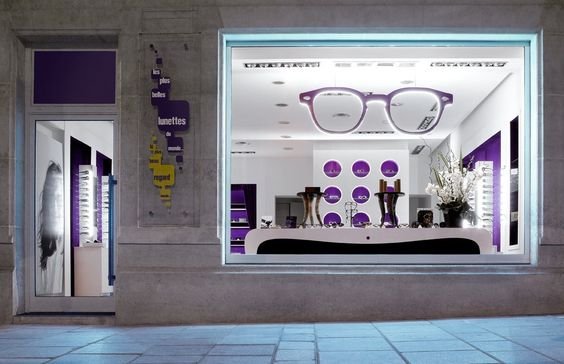
This storefront perfectly lights up their window, as well as their entire store. Lighting is important to make sure potential customers can see your products. People walking by should be able to see your product clearly, no matter what time during the day or night. This display also has pops of color that draws the eye throughout the entire store.
TIP #2 Color Theory:
A great way to grab the attention of passerbys is to stimulate different feelings with colors. Blue is commonly described to promote trust in products, while green stimulates harmony in your brain and encourages a balance leading to decisiveness.
This window display has a clear, cohesive theme throughout the display. The nature aspect is incorporated into the background and the frame holders. While the polka dots and stripes have a contrasting pattern, the similar colors draw your eyes across the window display.
TIP #3 Cohesive Feel:
Make sure the rest of the store is harmonious with your display during the holiday seasons. It’s important that there is no disconnect from what people see on the streets to the rest of your store.
Changing your display case often is essential in attracting new potential customers. Seasons are a great way to do this! With every new season, your display window should match. However, make sure to change your display once that holiday season has ended. Both displays play with the space in a great way; they aren’t afraid to go vertical, rather than having all the products horizontal.
TIP #4 Less is More… Sometimes:
Displays should not be full of clutter but should show items that grab attention.
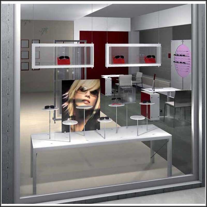
This display window does a great representation of the “No cluttering” rule. However, the simplicity of the window does not draw the eye in enough. There is no stand out feature that grabs and holds the viewers’ attention. The pops of red are good at drawing the eye across the display and throughout the store.
TIP #5 Sale Signage:
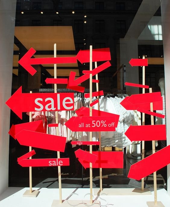
When using sale signs, keep these three words in mind: bright, simple, and big.
Bright red sales signs are a great way to grab attention. Certain colors draw a person’s attention in better than others and red is proven to do so better than any other color. Red creates a sense of urgency, which is good for clearance sales. This display clearly states where it wants you to go, as well as the amazing offer waiting for you inside. Simple design does not distract the viewer from the actual product.
For more information on everything optical from Zyloware, be sure to follow us on Facebook and on Instagram, and tell us what you think in the comments below! We love hearing your feedback.


